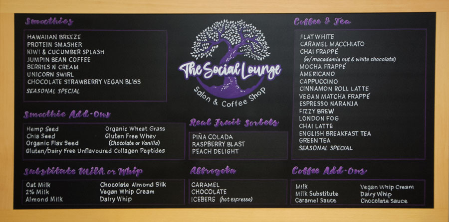
Hello folks! It’s that time of year again…time to gird your loins for the upcoming tourist season. If you are currently revitalizing or creating your menu, consider these helpful hints regarding chalkboard menu sign psychology found in an article Business Insider published online entitled “11 Psychological Tricks Restaurants Use to Make you Spend More Money” (July 14, 2014) that speaks to some very basic tips on making your menu more palatable to the customer:
Don’t use dollar signs on your chalkboard menu signs – use numbers only. Dollar signs remind customers they will be spending money. Something you want them to do, not necessarily think about.
Limit the choices on your chalkboard menu sign – remove the responsibility people feel when they have to choose what to eat. Between 6-10 items is optimal depending on the type of establishment you own.
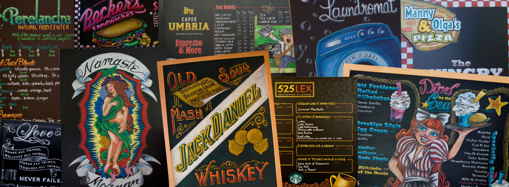
Contact us today for more information on getting your very own psychologically enhanced chalkboard menu sign.
Until next time,
Melanie (I am not a doctor. I only play one on tv.) Teichroeb
